New Icons
Forum rules
*******************************
Please be aware we are now using GitHub for issue tracking and feature requests.
- This section of the forum is now closed to new topics.
*******************************
*******************************
Please be aware we are now using GitHub for issue tracking and feature requests.
- This section of the forum is now closed to new topics.
*******************************
-
meathead100
- Posts: 11
- Joined: Tue Jul 17, 2012 4:45 pm
Re: New Icons
I thought of trying a "blown" light but decided it might make the word too hard to read. There could be some clever flickering or blinking, but that would probably get annoying pretty quickly and just make load times longer. Old & broken is probably not the message you want to send anyway... 
Re: New Icons
Maybe try a few other colour schemes. Red on blue (or blue on red) is notoriously hard to read.
Re: New Icons
The Application icon is now deployed, so it's just the in-app icons that need finished off.
Anyone up to completing the set (https://trac.handbrake.fr/browser/trunk/gfx/icons) in the same kind of style?
I think the following are the only remaining ones that could do with an overhaul.
Anyone up to completing the set (https://trac.handbrake.fr/browser/trunk/gfx/icons) in the same kind of style?
I think the following are the only remaining ones that could do with an overhaul.
Re: New Icons
Here are some versions for the rest of the icons. Sorry for the delay.

Re: New Icons
Any chance you could PM me the full set? There were some different play/pause buttons on the previous pages too. Would be good if we had the masters for those too.
I might try get these into the GUI at the weekend so we can see what works and what doesn't
Thanks!
I might try get these into the GUI at the weekend so we can see what works and what doesn't
Thanks!
Re: New Icons
Yeah. I want to refine the help info and error buttons a bit and ill send them your way.
-
Deleted User 33235
Re: New Icons
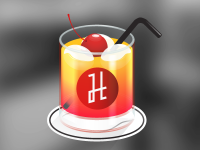
Hi everyone,
I recently had to encode a video. During the encoding I doodled something for handbrake.
I read somewhere that the cocktail was necessary, but I allowed myself to change the glass
What do you think?

I really appreciate your great work, so don't hesitate if you need some design work.
I recently had to encode a video. During the encoding I doodled something for handbrake.
I read somewhere that the cocktail was necessary, but I allowed myself to change the glass
What do you think?

I really appreciate your great work, so don't hesitate if you need some design work.
-
Smithcraft
- Veteran User
- Posts: 2697
- Joined: Thu Jan 22, 2009 8:04 pm
Re: New Icons
I like it!
SC
SC
Re: New Icons
Will the app icon be changed to OSX Yosemite style perhaps?
Re: New Icons
Im willing to update the in app icons to better suit the new styling in 10.10
Re: New Icons
Up to you really. if it's something you want to do, feel free. I don't have any real objections. I'm not sure what HB looks like on 10.10 but we should probably look using the new native header bar on it. This may or may not force us to change the icons.
Based on the Yosmite screenshots I've seen, It looks like they still have the grey style buttons, but are maybe a bit thinner.
If you want, maybe post a few samples and we can see how they fit in?
Fwiw though, I see no reason to change the app icon. It doesn't need to be in the style of app apps. Most apps have a non-os style icon anyway
-
meathead100
- Posts: 11
- Joined: Tue Jul 17, 2012 4:45 pm
Re: New Icons
Anyone interested in a flatter "Yosemite/iOS 8" look I have this available...
Larger image with transparency is attached.
Re: New Icons
Looking good. Do you have a psd for it? Might try it out in the app.
-
meathead100
- Posts: 11
- Joined: Tue Jul 17, 2012 4:45 pm
Re: New Icons
Glad you like it. Since there seems to be some interest, I tweaked it a bit further. It wasn't created in Photoshop, but here's a PSD with some control over the glass transparency.
- Attachments
-
- Handbrake Icon 2014 flat_v2a.zip
- PSD file
- (5.69 MiB) Downloaded 167 times
Re: New Icons
Apple's icons in Yosemite have still got shadows and textures. The current icon looks better on it then the proposed one imho.
-
meathead100
- Posts: 11
- Joined: Tue Jul 17, 2012 4:45 pm
Re: New Icons
I don't think anyone was proposing a change to the official icon. I supplied this as an option for anyone who may prefer it. Since I created the art for current icon, I thought I'd take a stab at it for fun. FWIW, I prefer the current one as well.
Re: New Icons
Is there a build of HB for Yosemite that i could run to test new icons on?
Re: New Icons
Any build should work fine. No code changes required to make it run under 10.10
Re: New Icons
Yeah, it runs well, not sure if there was a build that took advantage of any of the new UI elements.